You’ve got traffic. People are landing on your site. But they’re leaving — and you have no idea why.
This is the quiet crisis that kills businesses. Not a sudden crash. Not a bad PR moment. Just a slow, invisible bleed of potential customers who click away without converting. And nine times out of ten, the culprit isn’t your product or your pricing. It’s your UX.
Bad user experience doesn’t always scream at you. It whispers. It nudges people toward the exit so gently that you never notice the pattern until you’re staring at a flat conversion graph wondering what went wrong.
Let’s break down the UX mistakes that are doing exactly that — and what you can actually do about them.
1. Your Page Takes Too Long to Load
Three seconds. That’s roughly how long a user will wait before abandoning your page. Google’s research backs this up — as page load time goes from one second to three seconds, the probability of a bounce increases by 32%. Push it to five seconds, and you’re looking at a 90% increase.
Speed isn’t a technical nice-to-have. It IS your first UX impression.
Yet so many websites are bloated with uncompressed images, unnecessary third-party scripts, and poorly optimized code — all while the business owner wonders why their bounce rate is through the roof.
What to do: Run your site through Google PageSpeed Insights or GTmetrix. Compress images, enable lazy loading, ditch the plugins you don’t need, and consider switching to faster hosting. Every second you shave off matters more than you think.
2. The Navigation Makes People Think Too Hard
There’s a famous principle in UX — Steve Krug’s “Don’t Make Me Think.” When users have to figure out where to go next, you’ve already lost them.
Confusing navigation is one of the most common conversion killers. Too many menu items. Vague labels like “Solutions” or “Platform” instead of something concrete. No clear path from landing page to product page to checkout.
Users aren’t explorers. They’re impatient. If they can’t find what they’re looking for within seconds, they leave.
What to do: Audit your navigation from a stranger’s perspective. Better yet, watch a usability test recording on tools like Hotjar or UserTesting. You’ll be surprised how quickly you spot the confusion points. Keep menu items to seven or fewer, use plain language, and always give users a clear “next step.”
3. Your CTA Is Doing Nothing
“Submit.” “Click Here.” “Learn More.”
These phrases are the beige wallpaper of the internet — so bland that people’s eyes slide right past them.
A weak call-to-action is one of the most overlooked conversion mistakes. And it’s not just about the words. It’s the color, the placement, the size, the context around it. A CTA buried below the fold, competing with three other buttons of the same size, surrounded by cluttered text? That’s a conversion waiting to die.
Your CTA needs to do one job — make the next step irresistible and obvious.
What to do: Replace vague phrases with specific, value-driven language. “Start My Free Trial” beats “Sign Up” every time. “Get My Custom Quote” outperforms “Contact Us.” Make the button visually dominant. Test different placements. And for the love of conversions, don’t put five different CTAs on one page and expect users to know what you want them to do.
4. You’re Designing for Desktop and Forgetting Mobile Users Exist
More than 60% of web traffic now comes from mobile devices. You probably already knew that. And yet, a shocking number of websites still treat mobile as an afterthought — cramped text, buttons too small to tap, images that break layout, forms that are a nightmare to fill out on a phone.
Here’s the thing: a frustrated mobile user doesn’t email you feedback. They just leave.
Mobile UX isn’t about shrinking your desktop design. It’s about rethinking the experience entirely. Thumb-friendly navigation. Simplified layouts. Forms that ask for the minimum. Fast, frictionless interaction.
What to do: Test your site on actual devices, not just browser preview modes. Use Google’s Mobile-Friendly Test. Prioritize vertical scrolling over horizontal interaction, make tap targets at least 44×44 pixels, and ensure your text is readable without zooming.
5. Too Much Friction in Your Forms
Nobody wants to fill out a form. They do it because they want something on the other side — an ebook, a quote, an account, a product. Your job is to make that exchange as painless as possible.
But so many forms demand too much. Twelve fields when three would do. Passwords with impossible requirements. Error messages that don’t explain the actual problem. No autofill support. Required fields that aren’t obviously marked.
Every unnecessary field you add is a conversion you’re leaving on the table.
What to do: Audit every form on your site and ask yourself — do I truly need this information right now? Stripe famously reduced their signup form to just an email and password, and conversions soared. Only ask what’s essential. Validate fields inline so users know instantly if something’s wrong. Make error messages human — “Please enter a valid email address” beats “Error: invalid input” every time.
6. Your Visual Hierarchy Is a Mess
When someone lands on your page, their eye needs a guide. Visual hierarchy is that guide — the intentional arrangement of elements that tells users what to look at first, second, and third.
Without it, everything competes for attention. And when everything is equally important, nothing is.
This shows up as pages packed with text in similar sizes, too many competing colors, no clear focal point, and headlines that don’t actually communicate value. Users scan before they read. If the scan doesn’t hook them, the read never happens.
What to do: Use size, contrast, whitespace, and positioning intentionally. Your headline should be the loudest thing on the page. Supporting content should guide users naturally toward your CTA. Whitespace isn’t wasted space — it’s breathing room that improves comprehension and focus. If everything on your page feels equally important, start over.
7. You’re Not Building Trust — And Users Feel It
Imagine walking into a store with no signage, no staff visible, no return policy displayed, and a broken front door. Would you hand over your credit card?
That’s how users feel on websites that lack trust signals.
Missing security badges. No testimonials or social proof. Stock photos that feel fake. An “About” page that tells you nothing. A contact page with just a form and no address, phone number, or real human presence.
Trust is earned through signals — and users have become very good at sniffing out their absence.
What to do: Add real testimonials with names and photos. Display security certificates, especially near payment sections. Show your team, your story, your face. Include a physical address and multiple contact options. If you have media mentions, awards, or notable clients — show them. These elements cost you nothing to add and can dramatically shift how users perceive your credibility.
8. Inconsistent Design Language
Users build mental models fast. When your design keeps shifting — different button styles on different pages, inconsistent typography, color schemes that don’t match, varying tone of voice — it creates subconscious friction.
It feels off. Even if users can’t articulate why, they sense something isn’t quite right. And that uncertainty translates to distrust.
Consistency isn’t just about aesthetics. It’s about psychological safety. When a website feels cohesive, it signals professionalism and reliability.
What to do: Develop and follow a design system or at least a basic style guide. Define your primary colors, font sizes, button styles, and spacing rules. Apply them uniformly. When every page feels like it belongs to the same family, users move through your site with more confidence — and confidence converts.
9. You’re Ignoring the Empty States
Empty states are the screens users see when there’s no content yet — an empty cart, a blank dashboard, a search with no results. Most businesses treat these as non-events. They’re not.
A poorly handled empty state is a dead end. A well-designed one is an opportunity.
“No results found.” Full stop. That’s a conversion killer. Compare it to: “We didn’t find what you’re looking for — here are our most popular products instead.” One abandons the user, the other guides them forward.
What to do: Design every empty state with intention. Add helpful messaging, suggest next steps, and keep users engaged. It’s a small detail that the best UX teams get right — and most others completely ignore.
10. You Never Actually Test Any of This
Here’s the honest truth that most articles skip over.
You can read every UX best practice ever written. You can redesign your homepage. You can obsess over button colors. But if you’re not actually testing how real users interact with your site — watching recordings, running A/B tests, analyzing heatmaps — you’re guessing.
And guessing is expensive.
UX improvement is not a one-time project. It’s an ongoing process of hypothesize, test, learn, and refine. The businesses with the best conversion rates aren’t the ones who had the most talented designer. They’re the ones who committed to understanding their users continuously.
What to do: Set up Hotjar or Microsoft Clarity for heatmaps and session recordings. Run A/B tests using Google Optimize or VWO. Create a simple feedback loop with your users — surveys, interviews, even a quick exit-intent pop-up. Let data tell you what intuition can’t.
The Bigger Picture
Here’s what all of these mistakes have in common — they come from building a website for yourself instead of for your users.
It’s easy to fall in love with your own design, your own language, your own assumptions about how someone should navigate your product. But users don’t care about any of that. They care about getting what they came for, quickly and without confusion.
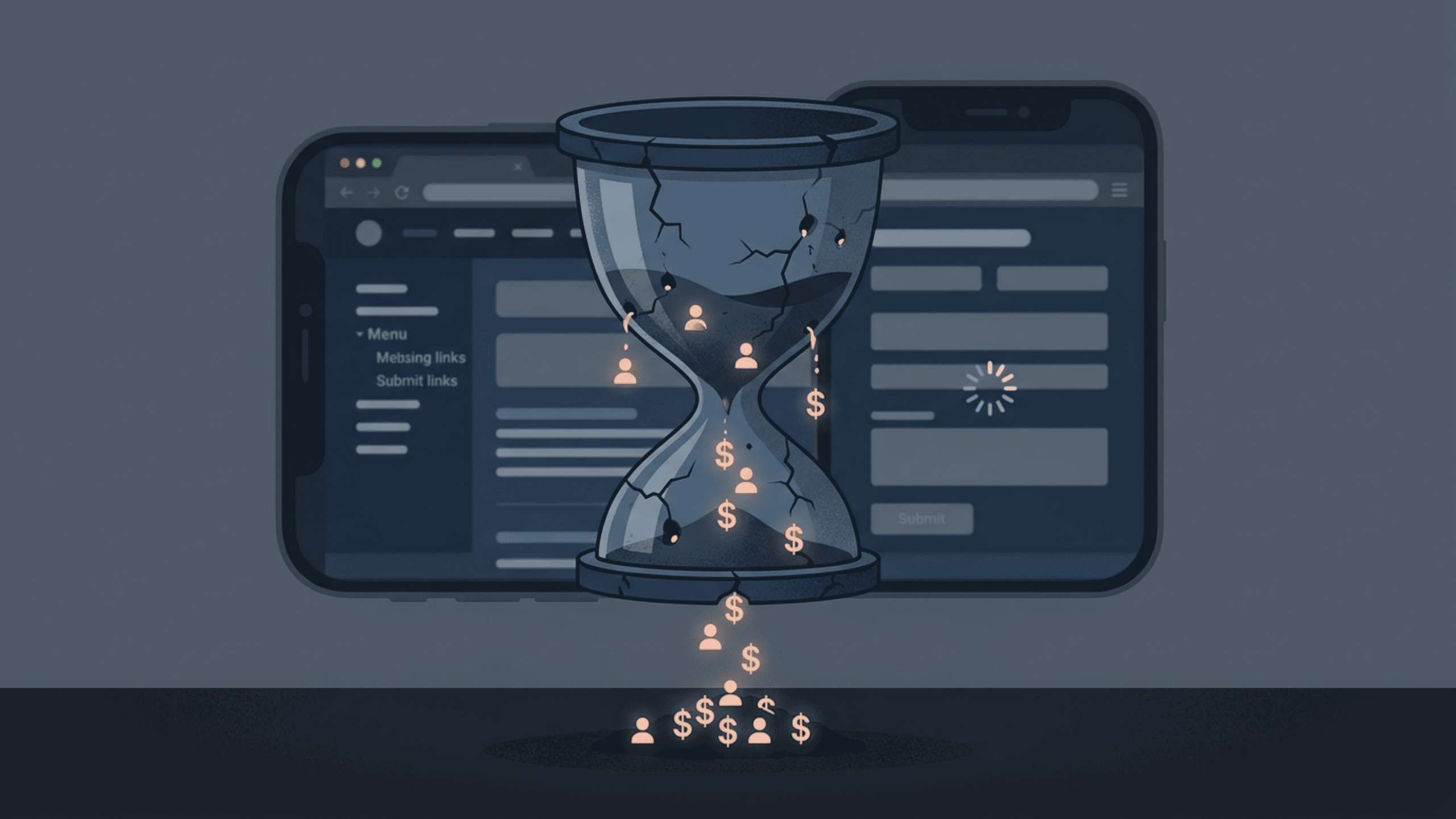
UX isn’t decoration. It’s the infrastructure of your entire conversion funnel. Fix it, and everything else — your ad spend, your SEO efforts, your content marketing — becomes more effective. Ignore it, and you’re pouring water into a leaking bucket.
The good news? Most of these mistakes are fixable. Not all of them require a full redesign or a big budget. Some require nothing more than a fresh perspective and the willingness to look at your site through a stranger’s eyes.
Start there. The conversions will follow.
Related Posts